Overview
Redesigning a family assistant around overwhelmed parents
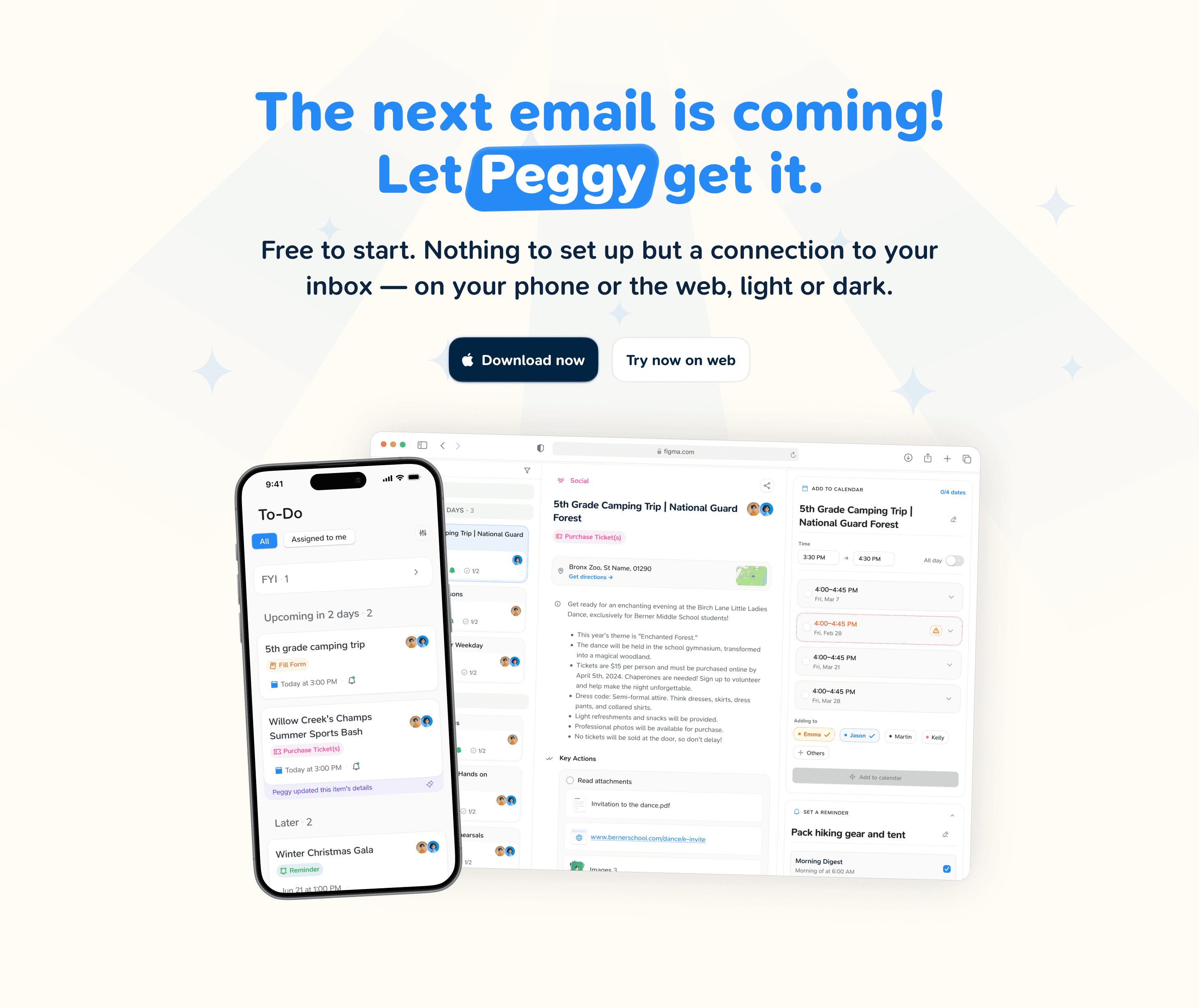
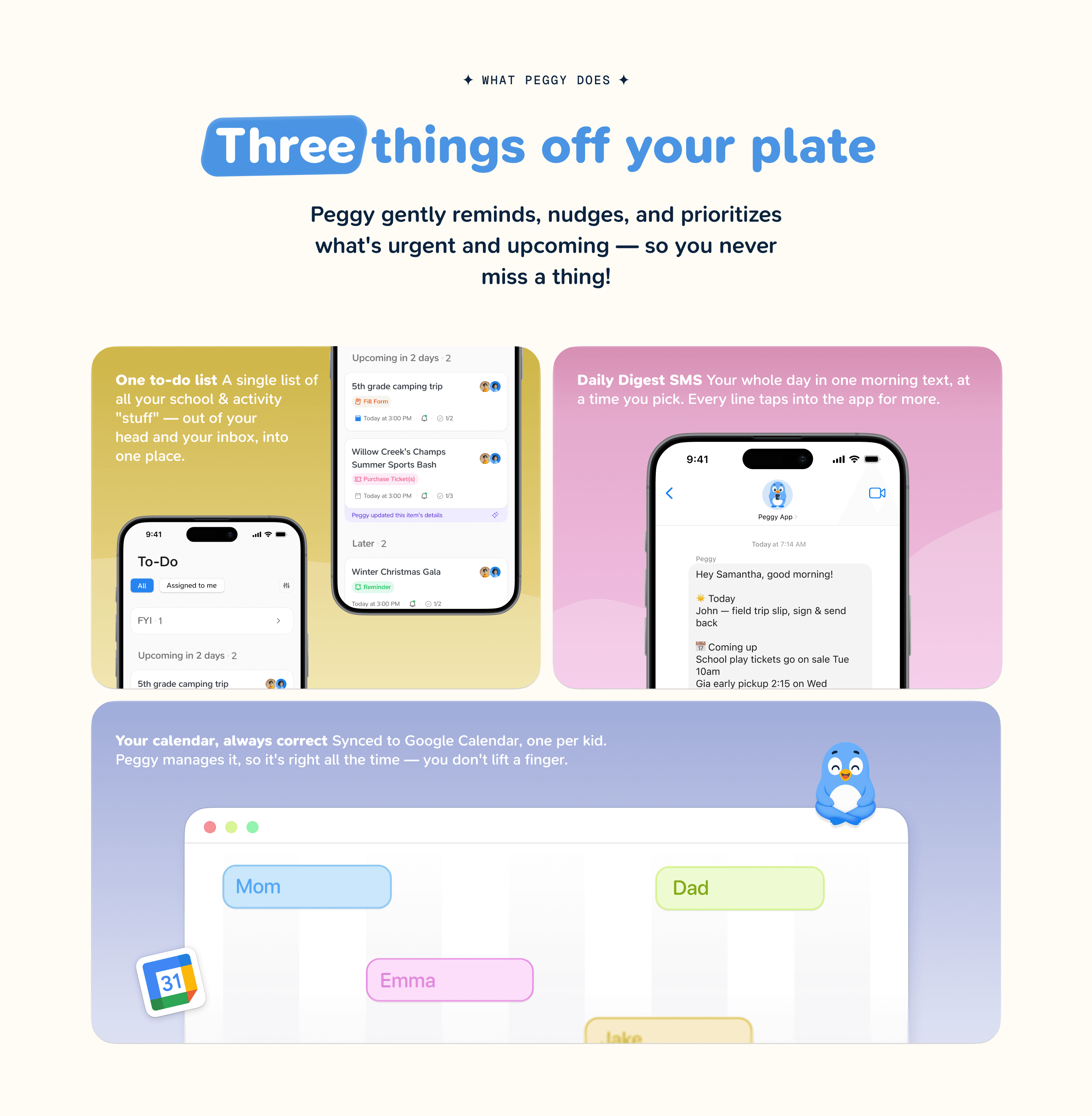
School emails, permission slips, sign-ups and dates land in one inbox and stay there. Peggy pulls them out and gives a parent a calendar, a short list of what to do next, and a nudge before it is too late.
Nearly 3×
Paywall conversion
78%
Paid retention
“The whole Peggy design has morphed into something extremely beautiful and the difference is very clear. Sometimes when I compare the old version (when it was just boxes, shapes, and text) to what it is now, I can’t help but smile. You didn’t just redesign screens, you gave the app feeling, personality, color, and intention. You completely transformed the experience. You actually made me understand the relevance of design and the true impact it has on users.”
 Ademoye AdejareEngineer, Peggy
About the project
Peggy worked. It just did not feel like something you would open at ten at night with the kids finally asleep. Onboarding was long and dense, and it asked for a lot before it showed you anything.
It read like software for work, and nobody using this is at work. They are tired, they are doing it in the gaps, and they have no patience left for a setup wizard.
- Services
- Product Design, Web, Marketing
- Engagement
- Ongoing retainer
- Period
- Feb 2025 – now
What we solved
Onboarding now gives you something back three times before it asks for much. You add your kids and you watch Peggy sort their things straight away, so the value is on the screen instead of promised further down.
We took the guilt out too. A lot of apps here hint that you are dropping the ball. Peggy does not. It is help, and it sounds like help.
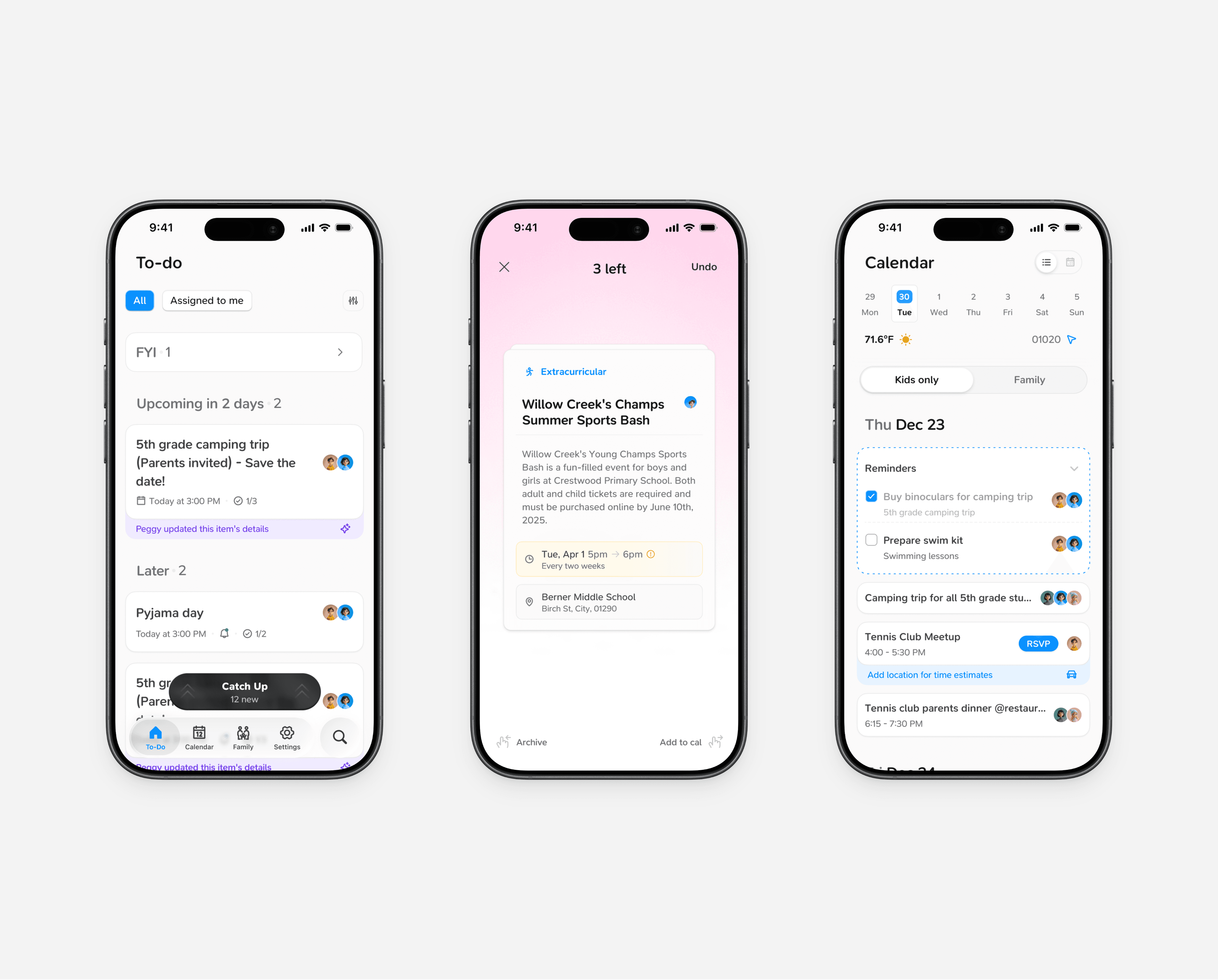
Most of the work went into Catch Up, which is where you actually live. The urgent thing is at the top and every card leads with what you can do — sign the form, buy the ticket, RSVP. Where and when sit underneath, because they rarely change your answer. Past eight cards it batches them, and when the ones that mattered are done, it says so.
What Peggy will not do
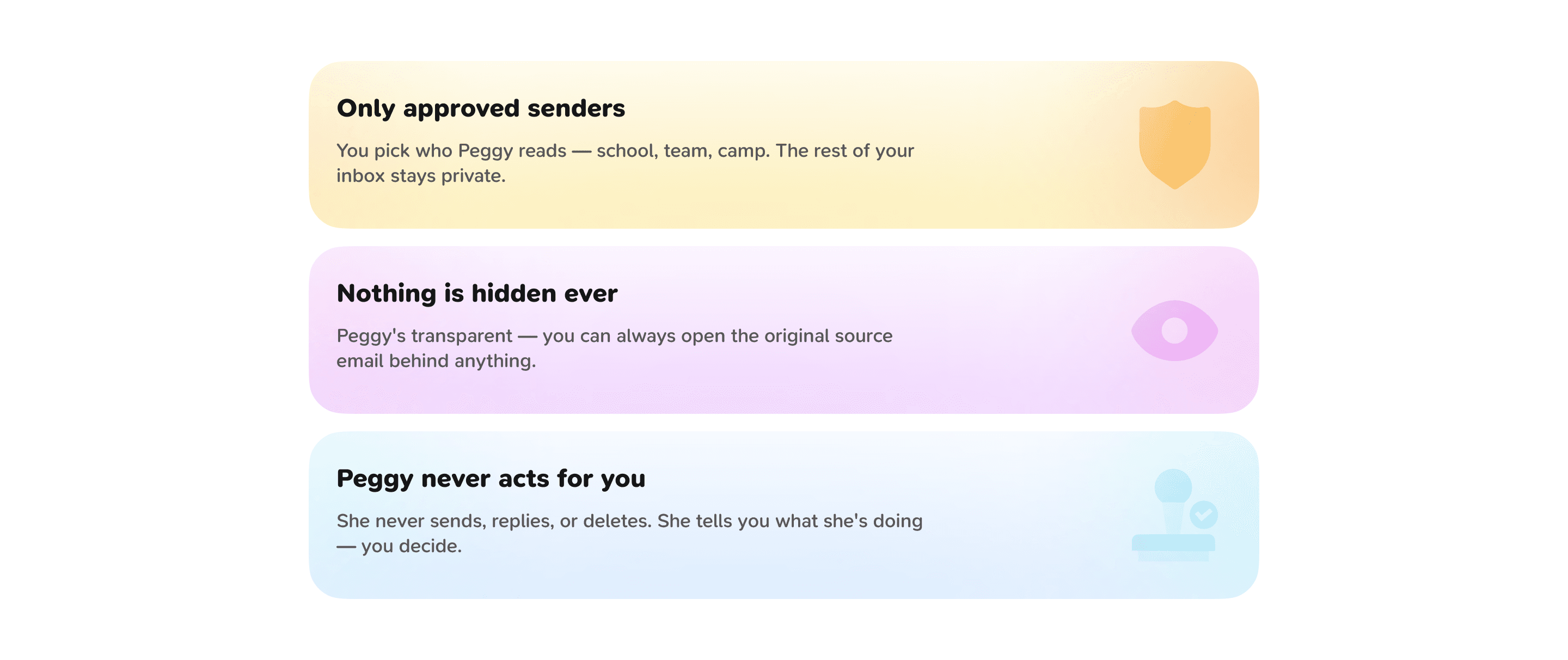
Peggy needs your inbox to work, so everything else about it is a trust question. The limits are on the marketing page rather than buried in a policy nobody opens.
You pick which senders it reads and the rest of your inbox stays shut. The original email is one tap behind anything it shows you. And it never sends, replies or deletes anything — it tells you what it found and you decide.
Where we stand now
Still going. The to-do update shipped, Google sign-in is live, and the onboarding work is landing in pieces.
The illustrations were their own problem. There are around 225 activities and you cannot draw them all, so it works in three tiers: real artwork for the thirty or so that come up constantly, shared motifs for the middle, and a catch-all for the rest. Any one family only ever sees a handful, which is why it holds up.

What we built
Onboarding
Shows you something useful before it asks for your inbox, then says what it is doing instead of leaving you watching a spinner.
School discovery
Searching 100,000-odd schools is miserable with no context, so it asks where you are and shows what is nearby, with a ZIP override and a manual form for when it misses.
Catch-Up
The list you check. Urgent first, the action up front, the details underneath, and a finish line once the ones that mattered are done.
Family calendar
Clashes shown per child, a choice of which sessions to drop when you remove a repeating event, and reminders that reach the other parent too.